.png)
Rehoming unused children's items to keep them in use and out of landfill
.png)
Tackling the inherent waste, product obsolescence and cost of raising children; we were tasked with creating an app that allows parents to give or receive children’s items that are no longer used, for free.
The product facilitates browsing or searching for specific items, communication between users to organise the exchange and the listing of new items to be given away. Following a successful release in Hackney and a crowdfunding campaign that raised £400,000, it is now being used by parents across London and Reading with plans for further expansion.
As the UX/UI designer on this project I was responsible for creating initial wireframes which were then tested with local families using a clickable prototype. Post release I also led work on refining the visual look and feel of the app along with the implementation of a number of additional features in response to direct user feedback.
The Problem

As they go through their younger years kids quickly grow out of toys, clothes and other items; meaning parents have a lot of unwanted items that either don’t fit, or their kids don’t want or use anymore - with much of this ending up in landfill.
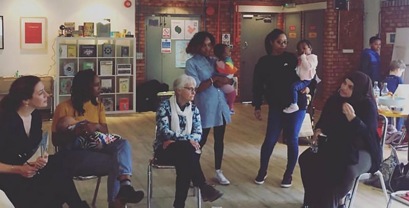
To tackle this, 'Reluctantly Brave', a consultancy and creative agency, had been organising community meet-ups for local parents in the London Borough of Hackney - inviting them to donate their unwanted children’s items, and receive any items from other families that they might need.
While successful, this solution was still limited in terms of accessibility and how many people could take part at once.
The Brief
The client had created a beta version app they were using for members of the meet ups. They needed us to first analyse the existing mobile app and its shortcomings, identify additional features and usability improvements, then implement these in the design, build and release of a brand new native app. The overall functionality of the existing app needed to be retained, ensuring it stays relevant to target users, but there were no other limitations placed on the redesign process.
Evaluating the existing app
Original app screens
The existing app structure was a major weak point, with navigation that did not provide a clear and intuitive journey to the user from the moment they start searching for an item to them actually receiving it. The app also felt like a collection of features that didn’t really work collectively to provide a great experience for the user - it felt disjointed.
Working with the client during multiple ideation workshops, I helped them to refine the product requirements into a clear set of features that would deliver the experience they were looking for, then set about creating some initial wireframes.
Developing Wireframes
The wireframe process focused on building a clear structure within the app, ensuring all of the functional requirements were met and plotting out clear and intuitive user flows to make searching for and requesting items as smooth and simple as possible. The aim was to include enough detail to allow us to carry out thorough user testing of an invision prototype to get feedback from potential users.
When designing the wireframes I focused on navigation; building a clear structure to ensure all functional requirements were met, while ensuring a clear and easy to follow primary user journey. The focus was on making searching for and requesting items as smooth and simple as possible.
.png)
User Testing
To ensure the app would meet the requirements of its users, I carried out thorough user testing in the local area. Using an InVision prototype I tested the app with numerous parents with varying ages of children, to understand whether improvements could be made to overall functionality and the individual user journeys within each feature.
“I’d like to be able to register that I’ve given the toy away so people don’t keep asking for it”
“The add new item button could have been more obvious”
“I think separating the inbox between your own items and ones you’ve requested would work better”
“It would be good to see a picture of the person you’re talking to”
This gave us valuable feedback resulting in minor structure and layout changes to small sections of the app, but reassured us that the general structure was efficient and easy use. Testing in this way ensured the final product was grounded in the feedback of real users, rather than our own assumptions.
The Result
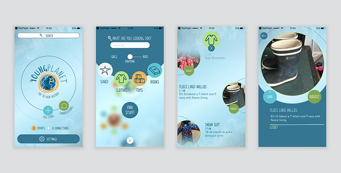
YoungPlanet Mobile App
YoungPlanet is an iOS and Android mobile app for the giving and receiving of children’s items for free, allowing parents to turn the stuff their kids don’t need into the things that others enjoy. It combines transactional functionality with sharing economy principles to tackle the inherent waste, product obsolescence and cost of raising children - to help declutter modern homes and keep things out of landfill.


How it Works
After they’ve found an item they like, users can request it from the owner. This will let the owner know they’re interested in it and opens up a line of communication between the two - allowing them to discuss the item in more detail and arrange how, when and where it will be exchanged. Once this is complete, the owner simply removes the listing from the app, confirming it was given away and recording who to.

Key Features
Search & Favourite

Users can search for items by keyword, category, age range, gender and location to quickly find exactly what they're looking for. Within this they can combine and adjust these filters together to tailor their search further. Once they find an item they like they can favourite it, allowing them to build a 'wishlist' of items they like, or compare similar items to decide which one they'd prefer.
Request & Receive Items

Having found an item they like the users can request it, opening up a line of communication between themselves and the owner. A history of this chat is then stored in the users profile.
The direct message function allows the two parties to discuss the item in more detail, ask and answer any questions from either side, and ultimately organise the final exchange.
Sharing is caring

One of the main successes of the local meet-ups that cemented the concept as a viable a mobile product was how members of the community encouraged one another to attend; sharing information by word of mouth.
To encourage this even further, a sharing feature was built into the app - allowing users to share their own items, or others, to friends, family and social media. The aim of this is to increase awareness of the app, and ultimately inspire others to do their bit in tackling wastefulness.
Tracking Donations

Once the exchange is complete the owner of the item ends the listing and records who they gave the item to. Ending the listing avoids any unnecessary requests for unavailable items.
The app also tracks how many items each user has successfully given away; displaying a badge on their profile and on any other items they have listed. This is an area for potential gamification to create competition between users - tracking their contribution towards the end goal of keeping items out of landfill.
Post Release
Following release in December 2018, YoungPlanet has been well received by its users - while it's reach is currently limited to Hackney, popularity continues to increase; reflected by high levels of engagement within the app, user reviews and a successful round of funding on Crowdcube.
4.6/5
iOS Rating
3.6/5
Android Rating
50k+
Downloads
£400k
Raised

Design Updates
Following on from the successful round of crowdfunding, and in preparation for the app to be released across the rest of London and in other cities - some design updates were required to refine the visual look and feel, reinforce key features and introduce a postage and delivery option to the existing exchange mechanisms.
Refining the look

From feedback received from active users we wanted to update the app to make it feel a little more professional, while retaining its playful and friendly feel. The home page was updated to be a singular feed that gave more information about the items owner, location and category and a better view of the item itself.
In addition to this the details page was subtly restructured to make the favourite and share functions clearer, along with the owners name, picture and number of items listed.
Reinforcing Key Features
From the feedback given by active users we felt that some of the apps key features and USP's could be promoted better, and that users could be given more guidance on how to use the app effectively.

We decided to introduce a series of tutorial screens that highlight the positive social and environmental impact using the app will have, along with features such as searching, sharing items to social media and postage. This tutorial is always accessible through the users profile, ensuring they can always refresh themselves on how to use it if needed.
We also incorporated some additional guidance for users when they first list an item. Tooltips explain each section and give advice on what information to give about the item they're listing.

Delivery Options
In the initial release users were only able to exchange items in person after agreeing a collection point, however during secondary development a delivery option was added. When listing an item users can now mark it as collection only, delivery only or both - if delivery is selected they are then prompted to add their pickup address, with the receiver adding their own delivery address when requesting the item.

The owner of the item is then able to 'confirm' that they are giving the item to the other person from the direct chat. As they do this the system checks the pickup/delivery addresses and depending on location provides a link to a courier service, with instructions on what to do next.

The receiver is then able to organise delivery of the item, which they cover the cost of, facilitating the exchange of items between users in different boroughs or London or cities entirely - rather than being forced to exchange the item in person.
